The Colorize Grid is a docked panel that can be used to visually inspect the model components by property. It colorizes the selected components based on your selected properties, and also allows you to filter-select components. You can also Colorize Loads for easy visual validation of applied loads.
By default, the Colorize options panel is open when you start the program, but it can be closed by choosing to hide it, or by going to Visibility > Message Bar and clicking the Colorize icon shown in the following image. The icon in the Visibility ribbon acts as a toggle, allowing you to switch between displaying and hiding the panel.
![]()
In ADAPT-Builder the Colorize Grid, by default, opens on the left side of the user interface in the Colorize tab as shown in the following image.
Click on image to enlarge
You can dock the Colorize options panel on any side of the modeling window or allow it to float on screen. See Float, Dock, and Hide Panels for more details.
In the larger view of the Colorize grid (shown below), we have a few icons at the top. The first two icons are the Expand All and Collapse All and the second two are Refresh and Clear.

Colorize options panel showing the four icons
Colorize Options Panel Icons
| Icon | Feature | Description |
|---|---|---|
|
|
Expand All |
Expands all categories in the Colorize Grid. |
|
|
Collapse All |
Collapses all categories in the Colorize Grid. |
|
|
Refresh |
Updates the Colorize component list to include the currently visible components selected in the model editing panel. |
|
|
Clear |
Clears the colorization of the components in the model editing panel, and returns them to their default coloring. |
When a model is opened, the program populates the Colorize Grid’s Property column with the names of components that are visible on screen. If you turn on or off the display of components while the Colorize Grid is open, the list is not automatically updated; instead, you need to use the Refresh icon to reflect the update.
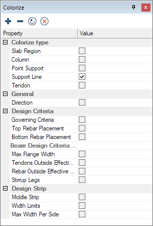
In the Colorize Grid, the properties on which the components can be filtered are listed in categories; the first being the 'Colorize Type' category. The Colorize Type category allows you to choose the visible component type in the model to be colorized. The remaining categories in the list consist of properties that the components can be colorized by.

Colorize Type category and visible components
The Colorize options panel consists of two columns; Property and Value.
The Property column lists the currently visible components that can be colorized (the component that cannot be colorized will not be included in the property list) in the model panel, as well as the properties (listed by category), that the components can be colorized by.
The Value column consists of selection boxes you can check and uncheck, to filter the component and property or properties the program is colorizing for.
If you choose a single component, the properties the component can be colorized by become visible. If you choose multiple components, the properties that are alike between the components are displayed. you can choose the property or properties you want to colorize the checked marked components by.
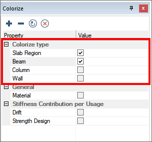
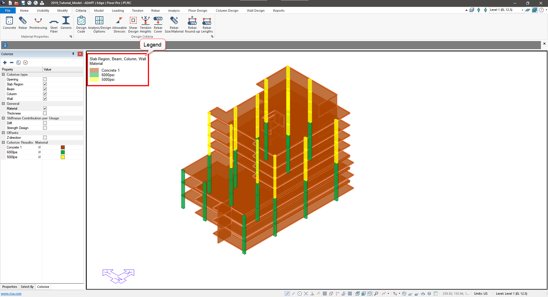
If we show the beams, slabs, columns and walls, and then colorize by material, the following view would appear on screen. With slabs and beams selected in the example model, the Colorize Grid shows the properties as shown here.

The components of the model are shown colorized per the value of the property selected. A legend appears in the upper left showing the color and the property that the color corresponds with. This tool makes it easy for you to perform integrity checks on your model prior to analyzing. In addition, the Colorize option improves the visibility of the model when viewing like components with different properties.
An added feature to the Colorize option is the ability to filter selected components and their properties based on colored components.
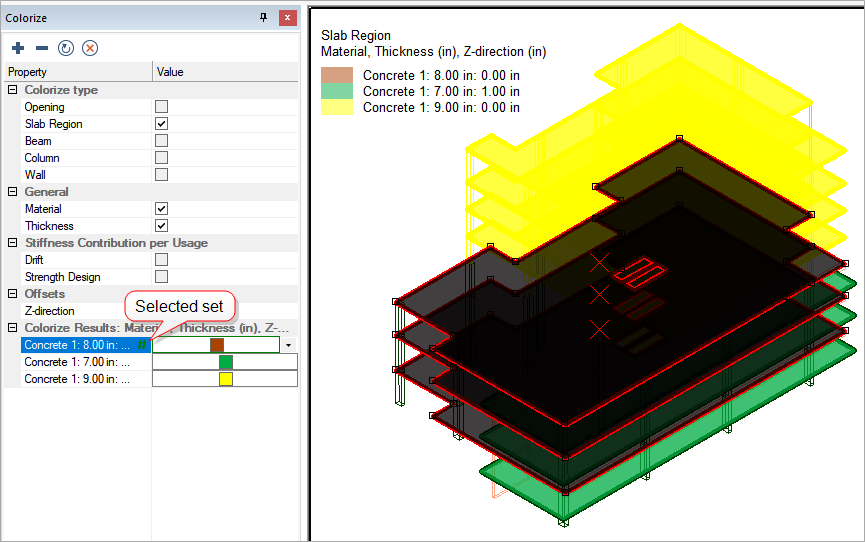
Once you have selected the components to color and the properties to colorize by, the Colorize Grid is populated with the Colorized Results category. In this category the program lists the different properties the components fall into, in the Property column. In the Value column, the program shows the corresponding color for the colorized properties.

If you left-click on the cell in the Property column in this category, the program selects the corresponding slabs.
If you click on a different cell in the Property column in this same category, that colorized selection set is added to the currently selected group.
If you click on a selected colorized group, it removes those components from the selection set.
Selected colorized groups appear with a green colored # symbol in the Property cell. Unselected colorized sets appear with no # symbol.
An example of a selected set versus the unselected sets, is shown in this image.

You can select components in the manner described above and then switch to the Properties grid panel and make modifications to selection sets as needed.