The Properties Grid is a docked panel, that facilitates efficiency when modifying a single component or a selection of components. From the Properties Grid, you can also filter-select components that you select in the model space.
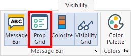
By default, the Properties Grid is open when you start the program, but it can be closed (by choosing to hide it, or by going to 'Visibility', 'Message Bar' and clicking the Prop Grid icon shown in the following image. The icon in the Visibility ribbon acts as a toggle, allowing you to switch between displaying and hiding the panel.
In ADAPT-Builder, the Properties grid automatically opens on the left side of the user interface, as shown in the following image.

Click on image to enlarge
You can dock the Properties grid panel on any side of the modeling interface, allow it to float on screen and automatically hide it when you move focus from the grid panel. See Float, Dock, and Hide Panels for more details.
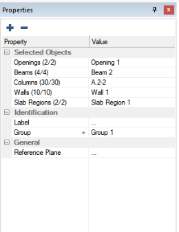
As you select components of the model, the two columns in this panel populate with like criteria of the selected component(s). If you choose only one component all properties for that component become available. If you select multiple components, the list populates with the properties that are similar between the selected components.
| Single-Selection View | Multi-Selection View |

|
|
The properties in the grid are listed in categories, which are groups of similar component properties across the single or multi-selections you have chosen in the model. You can expand and collapse these categories to hide or show specific component properties (see Expand/Collapse Property Grid Categories for more details). Each category contains two columns of information; Property and Value.
The Property column lists the properties whose values can be modified through this interface. If you define a property that can be selected in another location of the software, a "shortcut" to the window where the property is defined is provided in the Property column of the Properties Grid. The shortcut is denoted by a + icon to the right of the property name. The + indicates that you can click on the cell of this property in the Property column, and the program opens the window for defining the clicked-on property.
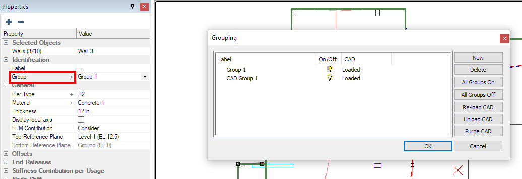
 EXAMPLE: Group Property Shortcut
In this example, we clicked on the Group cell of the property window (highlighted in red) and the program opened the Grouping window in which new groups can be defined.
Access Grouping Window from Group Filter
Another useful option that can be found in the Property column of the Properties Grid is the ability to filter-select components. You can right-click on a selected property component to get a list of right-click options. The options consist of Select All Type, Deselect All Type, and Isolate Selected Type. See Filter Selected Components for more details.
The right column in the Property Grid is titled Value. This column displays the value assigned to each property. The component is updated on-the-fly when you modify the property. You can also define the properties of a component you are modeling in this column, during the modeling procedure.
If you have selected multiple components with a similar property, the Value column shows either, the value of the currently selected component's property if all the selected components have the same value for that property or, the program shows three dots (…) indicating that the value is different between the selected components. You can click the (…) and enter a new value, if you want the property to be the same value across all selected components.
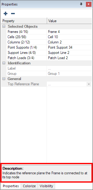
When you click on a property in either the Property or Value column, the program displays a detailed description of the selected property in the Description pane, found at the bottom of the Properties grid panel, as shown in the following image.